I wanted to mix up the blog updates a little, so you can expect to see a greater variety of useful content. This week, a new friend of mine, Leslie Belcher, asked for my help with her Facebook Page, Les Huston Designs.
Her main problems were visible. She had a sizeable number of fans despite having only created her page in late 2013. I will not question the tactics she used to attract her fans since I wasn’t present during the process. But one thing that stood out is the relatively low “People Talking About This” metric - why are engagement rates so low?
After acting as a user, I found 7 things that she could improve on and made 4 further suggestions for her. I hope that these suggestions may help her see some results in her Facebook Page soon.
Let’s start with the good news.
A. Personal tone
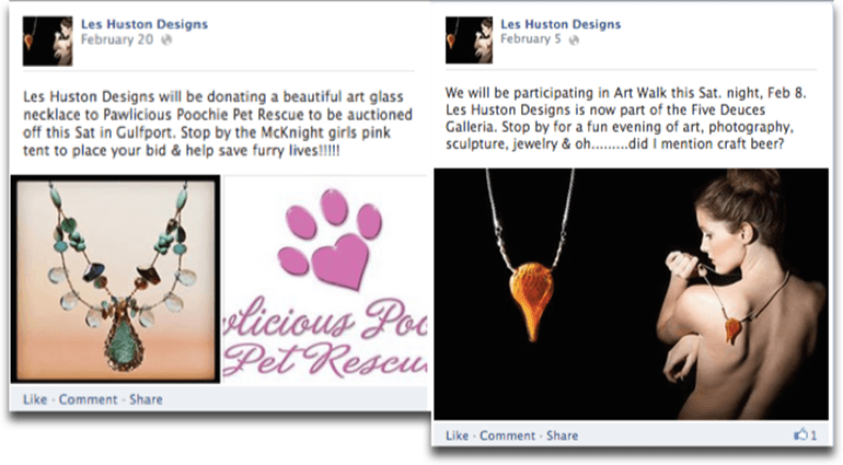
Use of personal tone is very relatable and engaging. As a fan, I am able to connect with the brand at a personal level. It feels like a friend talking to me.
B. Commendable CSR initiatives
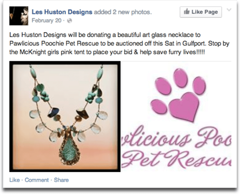
CSR initiatives are commendable. Sharing such initiatives will also help to build stronger relationships with your fans and customers, because they make your fans feel like you are also human and you care about the society.
C. Great post
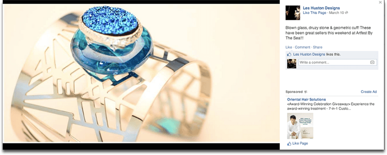
This post is my favourite. It realises my imagination of what a fine piece of jewellery looks like. The photograph also glamorize the piece of jewellery. A touch of class.
[divider type="thin"]
Now, let’s turn our focus to the potential improvements - look at the Page Cover section first.
1. Wasted real estate
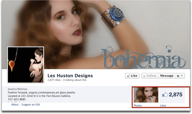
When I clicked on “About” to see the Page Info, I realised that the brand has a website. But it is not featured on the Facebook Page as a tab.
I would liken this to a physical retail store that hides away a corner of its products. The products are on display in a corner but they are not visible to the visitor. For every visitor that casually looks around and does not notice the corner, it is a potential sale lost. In this case, the consequences could be more severe. The website serves as a content hub and it’s where users may discover more about your company. A lost user may amount to a lost lead.
What I’d recommend Leslie to do: Make the website more prominent either by install a tab app (using Wufoo or Agorapulse) on the Facebook Page or including the URL in the Short Description section.
2. About Us section is not clear

Although the Page Category tells the user that this page is about jewellery/watches, it tells them very little about the brand.
The short description serves as the elevator pitch of your brand. In this case, it is not clear what benefits customers get from buying the jewellery.
Besides, the terms “fashion forward, organic, contemporary, art glass jewellery” might speak only to those who appreciate fine jewellery, limiting the number of visitors who will understand what your Page is about.
However, if Les Huston Designs wish to speak solely to the group of people who understands and appreciates fine jewelry, then the use of these terms is proper.
What I’d recommend Leslie to do: Write a 1-sentence elevator pitch for “Short Description”. Key the location and contact details into the respective sections instead.
3. Incomplete Page Info

Facebook has a distinct edge over other promotion tools. The edge lies in how it enables brands to build a relationship with customers at a 1-to-1 level.
Imagine that you are trying to get to know a stranger. You talk to the other party but you end the conversation without finding out what the person’s name is, what he or she likes, or any other details. After your conversation, you feel like you don’t really know the person. In fact, without the personal bit of detail, it is hard for you to remember the person, let alone develop an emotional attachment with the person.
What I’d recommend Leslie to do:
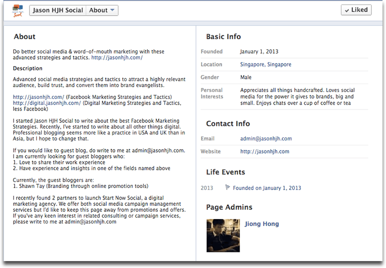
I use my Page as an example here. It is not perfect because I am continually refining my elevator pitch to improve the About section.
But the point of showing this example is this: it is true that the average visitor will not see your About Page. That is a weakness and you might think that it is not important to fill up your About Page, since only a small part of your Page visitors will see it anyway.
But if you look at it from another perspective, the visitors who do land on your About Page are likely to be the above average kind; the kind that is genuinely interested in the story behind your brand and the products you sell. These are the visitors you want to engage and build a relationship with, and your About Page plays an important role in establishing a connection with some of these people.
Also note that since I’m building a social (and personal) brand, I added a bit of personal details in the About Page section. Even if you run a big business, your About Page may feature your Page Admins or the people who engage with your fan base. Including some interesting details like their personal quirks might help your fan base relate and remember your brand better.
[divider type="thin"]
Now let’s take a look at the Page posts section.
4. Inconsistent schedule between successive post
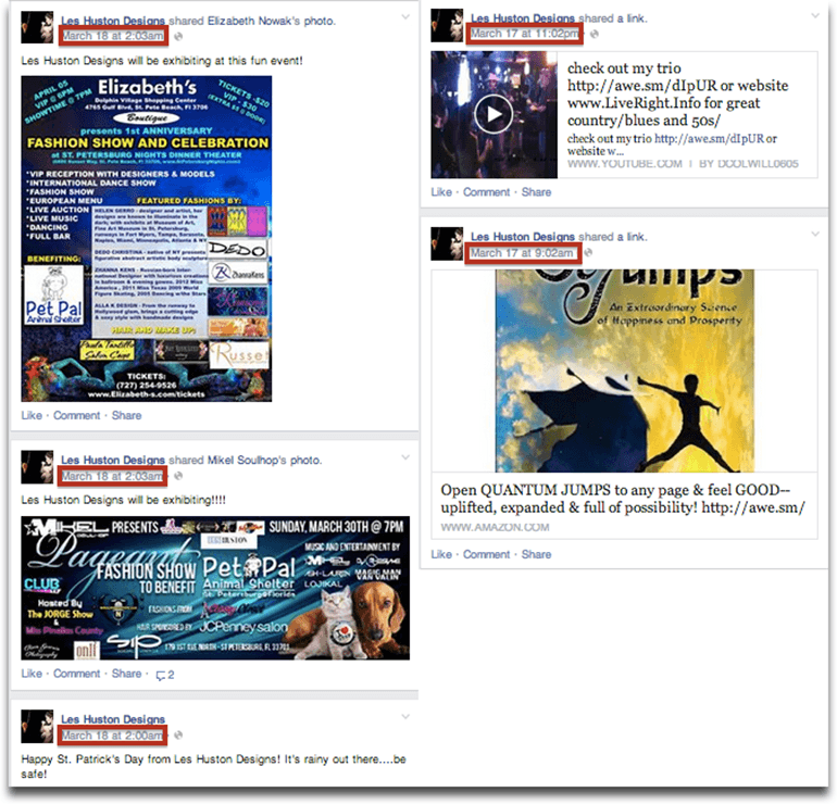
The space between each post determines how many people you reach. For Les Huston Designs, sometimes it is too short (3 posts in 3 minutes!). Other times, it is too long (More than 12 hours in between).
What I’d recommend Leslie to do: One key disadvantage of an inconsistent post schedule like this is reaching a limited pool of people. As Emeric pointed out here, the average Facebook post has a lifespan of 3 hours. This means that your ideal post schedule, assuming that you have a good proportion of fans online during each hour, should be about 3 to 6 hours between each post. Of course, you should always tailor it according to the constraints you have and your fans’ online activity times.
5. Lack of visual impact in posts
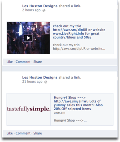
Although I’ve advised Page Managers to use post types (text, photos, videos, links) according to their needs, the fact is that the average Facebook user scrolls their newsfeed in a flash.
Unless you post something visually impactful, your fans are unlikely to stop and read what you post.
What I’d recommend Leslie to do: I still recommend Page Managers to use post types according to their needs primarily, but opt for a visually superior version when possible. In other words, avoid posting links without featured images, long patches of text without proper whitespaces, etc.
6. Too much shared content
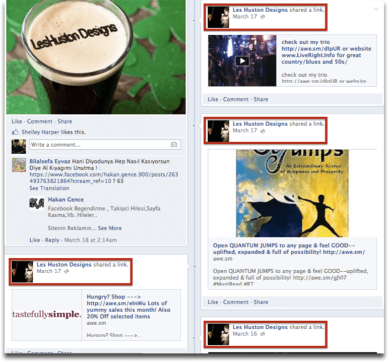
Spot the similarity above. Bet you could. Although sharing other content is good, I think Les Huston Designs has overdone it a bit.
If your fans are following your Page, they are more likely to follow you for your Page-related content than that of other Pages. The intention here is good, but just too much of one and too little of the other.
What I’d recommend Leslie to do: Plan a mix of original and shared content. I’d suggest even a ratio of 80-20. And you should micromanage and make sure that the shared and original content are well-distributed. Plus, you can also add your 2 cents either about your feelings or why you think the post could be relevant to your fans as you share those links.
7. Photographs communicate the image of your brand
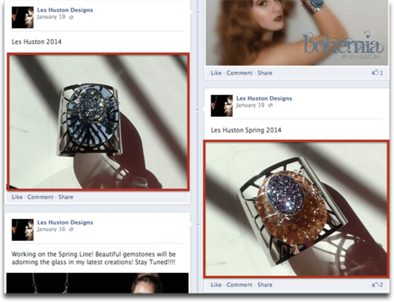
I feel that photographs that feature your product should always put it in the best light possible. After all, everything about your brand communicates. This ranges from the tone and choice of words to the content you feature in your Facebook post. In fact, it even includes your customer service, your staff’s interaction with outsiders, etc.
Since Les Hustons Designs falls inside the jewellery group, I think it is essentially a niche product that promotes local craft (Correct me if I’m wrong). I think their main customers are craft lovers and people who appreciate indie designs. But people wear jewellery as a sign of social status, or a fashion statement when it complements with their fashion perfectly. So whether is it an indie or premium design, brands that sell jewellery should convey credibility and quality from Day 1.
What I’d recommend Leslie to do: All these points to the importance of the photographs that feature your jewellery designs. These photographs thus have to be professional and exude the aspirational feelings that convey both quality and credibility. For example, shadows in the photographs should be treated.
[divider type="thin"]
It seems like there is a lot to do already! But all those are the fine details that can be remedied in a day or two.
Before I move to close this review with some suggestions, I’d recommend Leslie and the rest of the Page owners here to revisit their social media strategy. Is your Facebook or social media strategy helping your business to achieve your Facebook or social media objectives? If it isn’t, it is time to review your strategy. If it is, are your Facebook or social media tactics congruent with your strategy? Are you doing enough?
If your answers to all the above questions are “Yes”, then you’re on the right track!
So here’s my suggestions for Leslie and page owners who face similar problems as her.
I. Start from Scratch
The About Us page is a big problem. I won’t go into details here because I’ve explained the important parts and uses of having a completed About Us Page above. Post Planner has a good guide here that shares what you should do for a start.

Also, you can feature more relevant brands. I suggest that you can feature either brands that you (or your brand in the case of a separate entity) loves, or brands that your fans also love. I have also seen more creative ways to decide which brands to feature, such as collaborating with other local businesses to feature each others’ Pages.
II. Use more original content
Is pet adoption one of the causes you believe in? If it is, then you might want to share your personal feelings, thoughts, and perhaps some inspirational quotes or stories surrounding the cause more often to make that a core part of your brand identity. In fact, you may even feature fans who share the same beliefs. That will not only get greater commitment from the featured fans but the other fans will also relate to your brand more easily.
Mix up your content to create more variety for your fans. How do you do so? I’ve shared 2 ways this year. If you missed it, you can read it here and here.
III. Integrate the website and other web assets at a deeper level
I visited Les Huston Designs’ website and found some lookbooks. That’s a GREAT asset.
It is unique to your brand and gives your brand another touchpoint that will shape their perception about your brand. Although the concept of lookbooks is nothing fancy, the visual impact you can create using the lookbooks will set you apart from your competitors and create a unique brand identity that your fans can recognise.
IV. Consider running word-of-mouth campaigns
The strength of product companies lie in their ability to offer very relevant prizes when hosting contests.The prize may appeal to your core audience while mitigating the risk of attracting irrelevant fans.
Les Huston Designs falls in this category and they could consider hosting regular campaigns to spread the word about their brands, drive increased participation and engagement with their brands among fans. There’s a lot of incredible articles written about running such campaigns on Facebook, and you can start here and continue here, here, here and here.
And that’s it! If you would like your Page to be featured the next review, comment with your Page name and URL below! I will try to offer my 2 cents to all the Pages as much as time allows - first come first served!