Have you tried video marketing on Facebook?
Then you must have seen Facebook video’s dazzling statistics like the ones shared by Venturebeat, Forbes, Socialbakers, and so many blogs that I’ve lost count.
But let’s forget about those statistics for now and instead talk about you.
Have you posted native videos on Facebook?
How’re they working for you?
Not good? Then you’ll want to read till the end of this post.
I’m going to share with you a tactic that has helped a real client lower his cost per lead by 300%.
Yes, you heard it. 300%.
And the best part about this tactic is that it’s not difficult. You can do it without spending a dime.
In the rest of this post, I will share with you:
- What my client and I did initially and our results
- What we could have done next
- What we chose to do - you’ll be surprised!
- Whether our idea violates Facebook’s advertising guidelines - don’t worry, it is 100% permissible!
- How you can create the same thing for your video - and it’s free!
- When you should include it in your video
- Bonus material: Does the same tactic work for images? No guesswork on your part - just see my $1,650 ad experiment!
How to create a simple video CTA that easily beats Facebook’s
Basically, it all started when my client and I dipped our feet into video marketing on Facebook for the very first time.
What we did initially and our results
We basically uploaded a 86-second long video assuming that it’ll succeed because of all the talk ongoing about how using video leads to higher organic reach.
Have you heard of Murphy’s Law?
Basically I meant to say when you leave things to chance, what may go wrong will go wrong.
Unsurprisingly, our “build it and it will come” approach to our first video campaign ended with disappointing results.
In case you’re curious about the extent of our failure, here were the results:
- Video views: 5464
- Leads: 12
- Conversion rate: 0.22%
What we could have done
We knew there were many things that could be improved.
For example, we could…
- Shorten the video to only talk about the benefits our customers care about
- Restructure the video to adopt the wildly successful P-A-S copywriting flow from first identifying the problem, then agitating the problem, and providing your solution
- Make use of a more compelling Call-to-Action (CTA)
But have you seen Facebook video’s native CTA?

Photo credit: Facebook
They’re standard and boring. And it only appears at the end of your video.
So what?
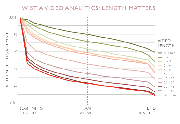
According to Wistia, for a video between 1 and 2 minutes in length, less than 50% of viewers will watch it to the end.
That means less than half of people actually have a chance to even see your CTA! And it gets worse as your video becomes longer.
So what would you do if you were me?
Would you shorten the video? Test another CTA? Or reproduce the video?
What we chose to do
If you’ve been reading my articles for the past 1.5 years, you’d know I’m not the kind to just follow the most popular social media advice.
So while reading all of those solutions I listed above, you’re probably thinking in your head, “Nah, Jason would not do any of this!” And you’d be right!
Here’s what we chose to do instead - create our own Call-to-Action (CTA).
I’m going to give credit to my client for coming up with this idea. He’s definitely my favourite client to-date and has been a great joy to work with.
Here’s how the solution actually looked like.
In case you’re curious, the CTA appears at the 20th second in the video, because we found that there was a sharp drop-off in views at this point.
And the CTA is not actually clickable in the video. But hey, it reduced cost per lead by 300% for my client!
Here’s how our idea works in theory: the CTA first grabs a viewer’s attention, then directs him to key in the URL to access your irresistible offer.
So as you might have guessed, the URL should also be easy for the user to type.
Let’s quickly recap what I’ve mentioned before you learn how to create a CTA like this for your own videos
1. CTA appears where most viewers stop watching
2. CTA is not clickable
3. URL should be short and easy to type
Does this violate Facebook’s advertising guidelines?
To be sure, I read through Facebook’s advertising guidelines.
After all, nothing’s worse than getting your Facebook account banned.
But after several checks and even running the actual ad, it was in line with Facebook’s guidelines!
HOWEVER! Before you run off creating something like that on your own, I think it’s my responsibility to communicate this to you:
Facebook will not tolerate any misleading ad. In other words, while creating a CTA like mine above is in line with Facebook’s guidelines, it is not permissible to insert a CTA that inaccurately reflects what happens after someone clicks on your ad. I know that some marketers will eventually screw up. Dang.
How you can create a CTA exactly like mine - without spending a cent
Creating a CTA like the one I just showed you is simple:
- Open up your video in any free video editor or sign up for a trial version of Camtasia
- Create a text box and resize it to look like a ribbon
- Move the ribbon to the top of the video
- Select a start and stop duration
- And you’re done!
Let me show you how I do it using Camtasia.
First, open up your video in Camtasia.
Click on “Annotations” on the left sidebar, and look for the text box below.
Next, drag the text box into the video and place it at the top.
Change the text into your main sell or value proposition.
Then add another text box into the video.
Place the 2nd text box over the 1st, and change the text to include the CTA and link.
Remember: The link should be easy for the viewer to remember and type into his browser.
Once you’re done, click on “Share” in the top menubar and export it as shown in the screenshot above.
If you’re wondering when you should make this ribbon appear in your video, read the next section.
When to insert the CTA in your video
Basically, you’ll want to insert the CTA just before viewers stop watching your video.
The method I’m about to teach you requires you to have posted the video on Facebook for some time. If you haven’t, you can also spend $10 to promote it to your target audience to find out when viewers stop watching your video.
- Go to Ads manager
- Click on “Reports” on the left sidebar
- On the popup, go to the “Videos” section
- Tick “Avg Duration of Video Viewed”. The rest are optional
- Click “Apply” on the bottom left corner when you’re done
Finally, to see when your CTA should appear in the video, look at the “Avg. Duration of Video View” column.
And that’s it. Now, go back and edit your video and you’re ready to go.
Your turn to act
What do you think about the video optimisation method that I just shared with you? Would you try it?
Are you thinking whether a CTA would also work in your image post ads? Don’t second guess yourself, just check out my experiment by clicking on the image below.
